Hey,
Did you guys previously have a WW2 theme for this forum or has it always just been the default colours of vbulletin?

Hey,
Did you guys previously have a WW2 theme for this forum or has it always just been the default colours of vbulletin?
When I started here in November 2005 the colors were different - browns and beige. I believe the current theme is the second or third change since I’ve been onboard.
We had a military-ish theme but it went, it would be very nice to have a choice of themes.
I would be happy with beige and brown…nothing to wild thou. The blue and white is getting kinda painful.
What I’ll probably do is hire a designer to create a ww2 theme.
Feel free to post example styles so i can give the designer a guideline.
Whatever you do, don’t go for the khaki / yellow & green / camouflage type themes that have been done to death and, worse, make it hard to read the text against the background.
I’ve done a bit of website design over the past few years and I’ve come to the view that the best designs are what many major corporations are doing now, which is a white background with top banner or side logos / graphics / whatever to identify the corporation etc but the text is easy to read against the white background.
WWIIIC used to have a graphic headline which was in part taken from a studio type picture of a grunt with a rifle photoshopped onto a background I can’t recall. It looked alright. Maybe it’s in some sort of archive or one of the admins can pull it up?
P.S.
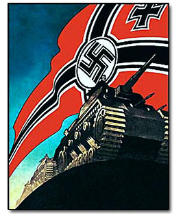
WWII poster art, apart from well known images like Rosie the Riveter, tends to be overlooked when it’s a great source of illustrative art for a website. Here’s a few examples which could be used as part of a banner or for specific categories.


The first internet forum I really posted/moderated at still has one of the best layouts I’ve seen on the web. The site is down for an “update,” a huge challenge since the vbulletin software was dated from 2004, and was never updated with security patches making the whole thing so unstable it slowed to a virtual crawl and became untenable. But here’s an archive snapshot:
http://web.archive.org/web/20060212231905/www.rotharmy.com/forums/
There’s something about the dark gray background that makes it standout, and it does look sort of military-ish…